Using mobile apps, we navigate to another view, calculate business expenses, or send a tweet by tapping on a button. SwiftUI makes it a breeze to construct a button. This time we will talk how to do it in three ways using the view modifier approach, building a custom view modifier, and applying the button style.
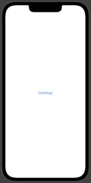
We are going to start with the most basic SwiftUI button and style.
Button("Continue", action: {})
Using a Custom View Modifier
In SwiftUI view modifiers are used to change the view in some kind of way. We can build a custom view modifiers ourselves. We will try to build one to create a custom button.
At first we need to create the custom modifier. To do that we should use the ViewModifier protocol that requires to implement one function func body(content: Content) -> some View which takes in a view and produces a different version of that view.
struct CustomButtonModifier: ViewModifier {
  func body(content: Content) -> some View {
    content
      .font(.title)
      .foregroundColor(.white)
      .padding()
      .background(Color.blue)
      .clipShape(RoundedRectangle(cornerRadius: 20))
  }
}
We can apply the newly made view modifier with a .modifier modifier to the original view, but we can create an extension to the View protocol. That would allow us to use it in a more shorthand way.
extension View {
  func customButton() -> some View {
    modifier(CustomButtonModifier())
  }
}
We can create a SwiftUI button view now and apply our freshly created view modifier.
Button("Continue", action: {})
  .customButton()
Building a Custom View
Now let's look into how we can style a SwiftUI button by building a custom view. We need to create a custom view that we will pass into label parameter when constructing the Button with the init(action: () -> Void, label: () -> Label) initializer.
struct CustomButtonView: View {
  var body: some View {
    Text("Continue")
      .font(.title)
      .foregroundColor(.white)
      .padding()
      .background(Color.blue)
      .clipShape(RoundedRectangle(cornerRadius: 20))
  }
}
Now that we have our custom view, we can use it and create the button.
Button(action: {}, label: {
  CustomButtonView()
})
Applying the Button Style
The most popular SwiftUI way of styling a button is by applying the custom button style. SwiftUI comes with couple of built-in button styles, but this time we will create our own. To do that we need to create a custom style struct and conform to the ButtonStyle protocol that applies the standard interaction behaviour and we can customize the appearance ourselves.
struct CusttomButtonStyle: ButtonStyle {
  func makeBody(configuration: Configuration) -> some View {
    configuration.label
      .font(.title)
      .foregroundColor(.white)
      .padding()
      .background(Color.blue)
      .clipShape(RoundedRectangle(cornerRadius: 20))
  }
}
Now that we have defined our custom button style, we can apply it by using the .buttonStyle view modifier.
Button("Continue", action: {})
  .buttonStyle(CusttomButtonStyle())
Outcome
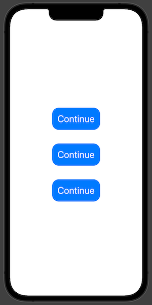
Let's put all the buttons one under another in the VStack and see the outcome. All of them should be the same.
TL;DR
A button is a gateway to most of our app functionalities like opening another view, sending a tweet or an email. With SwiftUI we can create a button in various ways like applying a view modifier, creating a custom view and styling it with a custom button style.