Alerts are one of the most crucial building blocks of iOS applications. We can use them to inform users about an error if something takes more time, like downloading a file or ensuring that everything is OK. Another use case with alerts is asking confirmation if our app users want to delete something or make a wire transfer.
SwiftUI has the Alert component, and there are a couple of ways how to use it. Let's check it out.
Alert
One of the easiest ways how to show the alert with SwiftUI is to have a local state variable to indicate if the alert should be visible or not. After that, we need to add a view modifier .alert that requires returning the Alert view.
@State private var showAlert = false

var body: some View {
  VStack {
    Button("Show alert") {
      showAlert = true
    }
    .alert(isPresented: $showAlert) {
      Alert(title: Text("Title"))
    }
  }
}
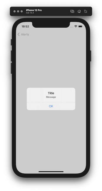
In the previous example, we saw that the showAlert state variable keeps a bool value. At first, the alert isn't visible, and it is false. When we press the button, we need to change the state variable to true which triggers the alert to be visible on the screen.

We can see that by default, the alert has an OK button to dismiss it. We will try to add more buttons later in this post.
For the Alert view, we can provide not only title but also a message field that is one under another.
Alert(title: Text("Title"),
      message: Text("Message"))

Alert with identifiable item
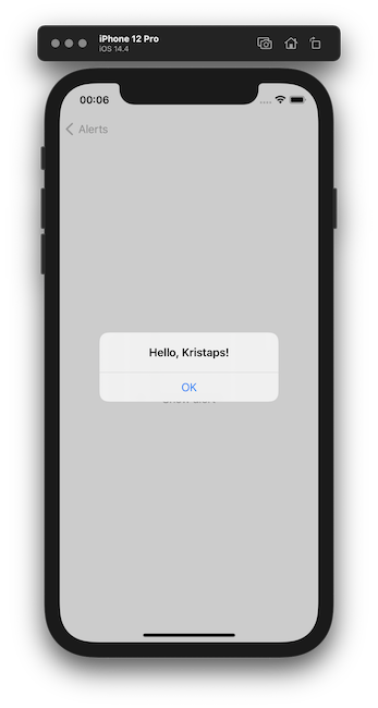
Another way to present an alert in the SwiftUI is by using an identifiable view state variable. Using this approach SwiftUI layout system passes the value of this state variable, and we can populate the alert title, message, or event buttons using its contents. The bonus is that once this item changes, the SwiftUI layout system would update the alert with the new value, which is a pretty neat feature that we get for free.
Let's see how to do it in the code. At first, we need to set up an object that implements the Identifiable protocol. Let's create a user structure. We need to create an id constant, and we could use the UUID structure that represents a globally unique value that can identify values between them.
struct User: Identifiable {
  let id: UUID
  let name: String
}
Next, let's move to the SwiftUI part and create our view.
@State private var user: User?

var body: some View {
  VStack {
    Button("Show alert") {
      user = User(id: UUID(), name: "Kristaps")
    }
    .alert(item: $user) { user in
      Alert(title: Text("Hello, \(user.name)!"))
    }
  }
}
It is important to note that the view state variable is optional because SwiftUI determines if the alert should be visible on the screen.
When using the .alert view modifier, we have the closure with an input variable which is the current value of the state variable. This way, we could populate, for instance, the alert title.

Alert Buttons
Now we know how to show an alert on the screen using SwiftUI with two different approaches. But how to show more than one button and customize them?
To add buttons for the alert, we could use either the Alert initializer specifying the dismiss button, or have the way to initialize the Alert, providing the primary and secondary button.
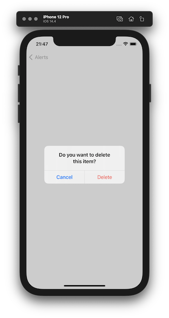
Let's create a confirmation alert that would ask our users if they want to delete something from a list.
@State private var showAlert = false

var body: some View {
  VStack {
    Button("Show alert") {
      showAlert = true
    }
    .alert(isPresented: $showAlert) {
      Alert(title: Text("Do you want to delete this item?"),
        primaryButton: .cancel(),
        secondaryButton: .destructive(Text("Delete")) {
          print("Delete item")
        }
      )
    }
  }
}
Let's unwrap the code. To show the alert, we are using our first approach with the view state variable that indicates when we want to show the alert on the screen.
Inside the .alert view modifier where we are constructing the Alert representation, we see that we are using a different initializer to provide information about alert buttons. That is a specific button that represents an operation of an alert. There are four different styles of buttons we could use in SwiftUI:
- default;
- cancel - indicates cancellation with a system provided label;
- cancel - similar like above, but with a custom label;
- destructive - indicates destructive action, for example, deletion.
We are using the cancel and destructive button styles for our confirmation alert because our users could cancel or delete the item from a list.

Show multiple alerts
To show multiple alerts on a view, we have two ways.
Using state variables
The first is to keep a view state variable per each alert. But we need to add the .alert modifier, not for the full view, but we can add it, for example, for the button that invokes the alert. If we add two .alert modifiers one after another, the SwiftUI layout engine will show only the first one.
@State var firstAlertShown = false
@State var secondAlertShown = false

var body: some View {
  VStack(spacing: 50) {
    Button("Show first alert") {
      firstAlertShown = true
    }
    .alert(isPresented: $firstAlertShown) {
      Alert(title: Text("First alert"))
    }

    Button("Show second alert") {
      secondAlertShown = true
    }
    .alert(isPresented: $secondAlertShown) {
      Alert(title: Text("Second alert"))
    }
  }
}
Using identifiable state variable
I like the second approach much better - it is more type safe. At first, we need to set up a structure representing the alert that conforms to the Identifiable protocol. Inside this structure, we have a local enumeration type representing all alerts types we would like to show and return the specific alert view. Ideally, it should be separated, but to show this example, I kept it like this.
struct AlertIdentifier: Identifiable {
  enum ActiveAlert {
    case first
    case second

    var alertView: Alert {
      switch self {
      case .first:
        return Alert(title: Text("First alert"))
      case .second:
        return Alert(title: Text("Second alert"))
      }
    }
  }

  var id: ActiveAlert
}
Next, we want to create the SwiftUI view and use it. Our view would have the local state variable with our new AlertIdentifier type when invoking and constructing the alert. We can use it and the computed alertView property that we had built before inside the ActiveAlert enum.
struct MultipleAlertsViewIdentifiable: View {
  @State var alert: AlertIdentifier?

  var body: some View {
    VStack(spacing: 50) {
      Button("Show first alert") {
        alert = AlertIdentifier(id: .first)
      }

      Button("Show second alert") {
        alert = AlertIdentifier(id: .second)
      }
    }
    .alert(item: $alert) {
      $0.id.alertView
    }
  }
}
A lot to unpack here, but the main point is that it's safe to show multiple alerts on the same view without adding a state variable for each alert. Using this approach, we don't need to worry if our alert would be shown to the user because we don't have multiple .alert view modifiers scattered around the view itself.
TL;DR
Showing an alert to inform our app users or ask for confirmation is essential for the user interface. We can show the alert with SwiftUI in two ways. The first one is by using a state variable that indicates if the alert is visible. The second uses an identifiable state variable that can be used to populate the alert title, message, and buttons.
We can set up multiple types of buttons for the alert. If we would like to show more than two, we need to use the SwiftUI sheets.
To present multiple alerts in the same view, we can achieve it either by multiple view state variables or by using one identifiable structure that would be responsible for creating the alert itself.