Showing and hiding some parts of information is a vital feature in mobile apps, especially considering that phone screens are much smaller than those on laptops or desktop computers.
Now with the new SwiftUI capabilities, we can collapse content with DisclosureGroup. Let's see how we could use it in various ways.
Display a collapsable content
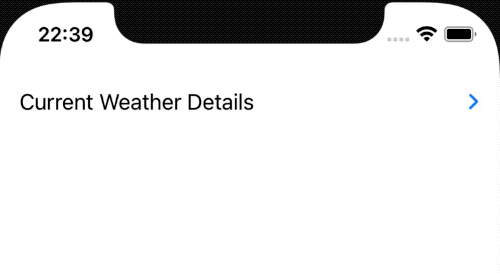
Let's start with the most straightforward way to set up a collapsable view that we could show or hide. It comes with a disclosure arrow indicator and nice animation.
In this blog post, let's use an example showing weather conditions that would be a SwiftUI view WeatherDetailsView and show temperature and wind information.
If we would like to show or hide that information, we can use the DisclosureGroup initializer by just passing a string value and content out the WeatherDetailsView view.
DisclosureGroup("Current Weather Details") {
  WeatherDetailsView()
}
Modify DisclosureGroup
Now let's check out how we can modify the DisclosureGroup. Currently, we can't do much, and it is pretty limited, but we can change the accent color and disable it.
Let's start with disabling the option to show and hide the weather information. We could do this by using the disabled modifier.
DisclosureGroup("Current Weather Details") {
  WeatherDetailsView()
}
.disabled(true)
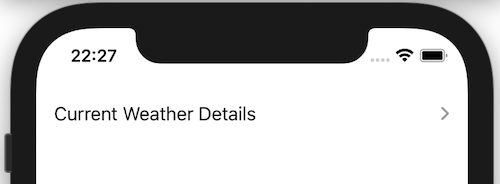
By default, the disclosure arrow comes in blue color. By using the accentColor modifier, we could switch to our desired color. We could use a system color or a defined color in the Assets catalog.
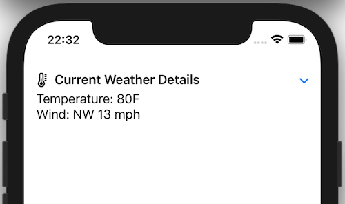
Configure DisclosureGroup title
So far, we have only changed the inner content of the disclosure group view. How about if you would like to change the title to a label view? The new Label comes with an initializer to pass the textual title and a system image's use that. For that, we can use a special DisclosureGroup initializer providing a custom label.
DisclosureGroup(
  content: {
    WeatherDetailsView()
  },
  label: {
    Label("Current Weather Details", systemImage: "thermometer")
      .font(.headline)
  }
)
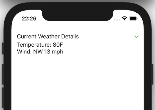
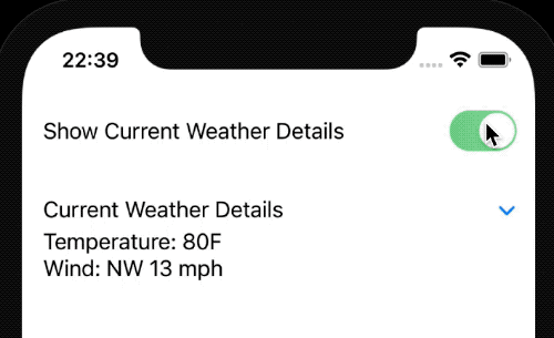
Manually control show/hide state
To either show or hide the disclosure group's content, we relied on the user to click on the arrow. There can be cases where we would like to change this behavior using a toggle button. To do this, we could use a state boolean variable that indicates either the disclosure group is expanded or not.
@State private var isExpanded = false

/// ...

Toggle("Show Current Weather Details", isOn: $isExpanded)

DisclosureGroup("Current Weather Details", isExpanded: $isExpanded) {
  WeatherDetailsView()
}
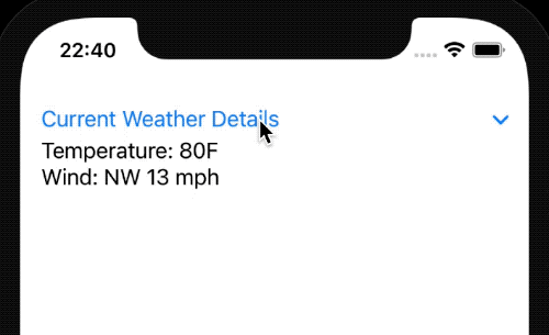
It is odd that once you press on the title, it does not expand; instead, we need to point our finger and press on the disclosure arrow button. We could fix it by implementing the title as a button and control the isExpanded property.
DisclosureGroup(
  isExpanded: $isExpanded,
  content: { WeatherDetailsView() },
  label: {
    Button("Current Weather Details") {
      withAnimation {
        isExpanded.toggle()
      }
    }
  }
)
TL;DR
Showing and hiding some information is a nice touch for mobile applications because of the limiting screen size.
The New SwiftUI version gives us a component out of the box specifically for DisclosureGroup.
Currently, it is pretty limited but offers some possibilities to customize it if we need to.