Grid layouts enable us to show views in a grid that expands either vertically or horizontally. We've all seen it, for instance, in the iOS Photos application. Those who have worked with UIKit might recognize it as UICollectionView.
SwiftUI offers two excellent options - LazyVGrid and LazyHGrid. This time, we will dig deeper and understand how we can use these components. The great thing about these two components is their usage; views are loaded lazily, which means when those appear on the screen.
I want to point out that HStack and VStack are available from iOS 14 and upward. If you're going to use grid layout in iOS 13, you should look into HStack and VStack, but the drawback is that those don't support lazy loading.
Creating a grid layout
Three steps are involved in creating a grid layout - have data set to show, configure the grid system, and initialize the grid layout itself. We are going to look into the last two. How to provide the data is an extensive topic and out of the scope of this post.
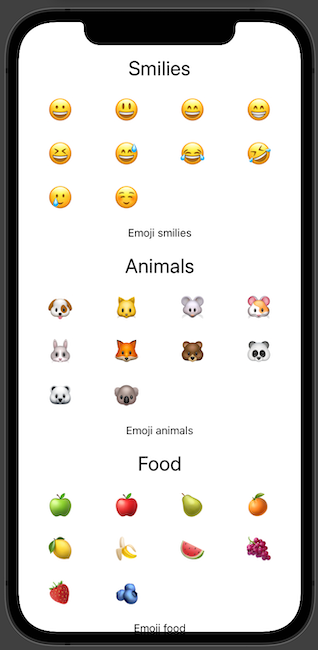
The initialization of a LazyVGrid is done by providing the columns, alignment of the items, spacing between the items, pinned views to the footer or header, and the content itself.
var columns = [
  GridItem(.flexible()),
  GridItem(.flexible()),
  GridItem(.flexible()),
  GridItem(.flexible())
]

var body: some View {
  ScrollView {
    LazyVGrid(columns: columns, spacing: 20, pinnedViews: .sectionHeaders) {
      Section(header: Text("Smilies").font(.title),
              footer: Text("Emoji smilies").font(.subheadline)) {
        ForEach(Emoji.smilies, id: \.self) { emoji in
          Text(emoji)
            .font(.largeTitle)
        }
      }

      Section(header: Text("Animals").font(.title),
              footer: Text("Emoji animals").font(.subheadline)) {
        ForEach(Emoji.animals, id: \.self) { emoji in
          Text(emoji)
            .font(.largeTitle)
        }
      }

      Section(header: Text("Food").font(.title),
              footer: Text("Emoji food").font(.subheadline)) {
        ForEach(Emoji.food, id: \.self) { emoji in
          Text(emoji)
            .font(.largeTitle)
        }
      }

    }
    .padding(.horizontal)
  }
}
With the LazyHGrid, it is pretty similar. We just need to exchange columns parameter to `rows.
Configure the grid layout
When initializing the grid layout, it is paramount to specify how it would look like - rows for vertical-style and horizontal-style grid layout.
SwiftUI has a component to describe a single grid item, GridItem. Grid item is either row or column.
When initializing the GridItem, these three parameters are vital:
size- size of the item;spacing- spacing between the items;alignment- alignment when placing each grid item.
Grid item size
We have three options to specify the size of the grid item:
flexible(minimum: CGFloat, maximum: CGFloat)- single flexible item in available space with optional parameters for min and max size;adaptive(minimum: CGFloat, maximum: CGFloat)- multiple items in available space;fixed(CGFloat)- single item with a fixed size in available space.
Let's see how each case works in practice with LazyVGrid and LazyHGrid.
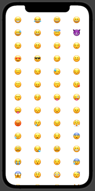
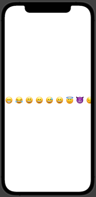
Flexible
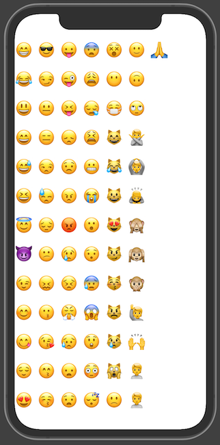
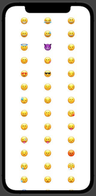
With the flexible grid item size, we can provide minimum and maximum, but it works great even without that. The item size is calculated by dividing available space by item count.
[
  GridItem(.flexible()),
  GridItem(.flexible()),
  GridItem(.flexible()),
  GridItem(.flexible())
]
Vertical
Horizontal
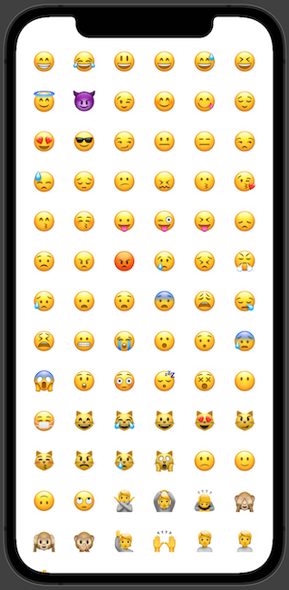
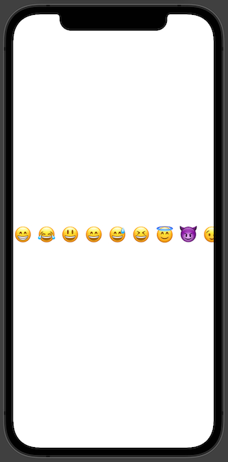
Adaptive
Adaptive grid layout size is the most suitable and appropriate 'GridItem` size. We need to provide the minimum and optionally maximum size, and the SwiftUI layout guide will take all the heavy-duty work away from us.
[
  GridItem(.adaptive(minimum: 50))
]
Vertical
Horizontal
Fixed
Fixed GridItem layout size is meant to use when we know the item size, and it is constant.
[
  GridItem(.fixed(100)),
  GridItem(.fixed(100)),
  GridItem(.fixed(100))
]
Vertical
Horizontal
TL;DR
Grid layout or previously known UICollectionView from UIKit times is a prominent building block to present data in a grid system. SwiftUI affords us components to build a grid layout either vertically or horizontally in a lazy manner; it means that items are loaded only when needed. These two components are LazyVGrid and LazyHGrid.
To create a grid layout with SwiftUI, we need to provide a data set, columns or rows, spacing between the items, and optionally pinned views (header and footer).