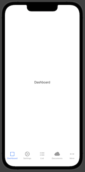
We learned how to add a sidebar for an iPad in the previous blog post, but that approach isn't that great for an iPhone. It looks pretty weird, and once we configure a default view, it automatically navigates to it once iPhone app starts. This isn't great on a phone but makes total sense on an iPad. We can improve that by showing a sidebar for an iPad and a TabView on an iPhone.
Checking if the device is an iPad
At first, we need to distinguish whether an app is running on iPhone or iPad. To do that, we should use the UIUserInterfaceIdiom enum. It can answer the question of what kind of device the app is running, starting with a phone and ending with a car within carplay.
This time we are interested in two enum cases:
phone- interface for iPhone or iPod touch;pad- interface for iPad.
To get the current device interface, we need to access it from the UIDevice class that represents the current running device. To retrieve the user interface idiom, we need to get it from the existing class variable from the UIDevice class. Then from the userInterfaceIdiom variable, we get the current device idiom.
To access this in a bit nicer way, we can extend the UIDevice class and add a new static variable that would be a shorthand version of the process explained before.
extension UIDevice {
  static var idiom: UIUserInterfaceIdiom {
    UIDevice.current.userInterfaceIdiom
  }
}
To make it even more sugar-coated, we can add two static variables to see if the device is an iPhone or an iPad.
extension UIDevice {
static var isIpad: Bool {
    idiom == .pad
  }

  static var isiPhone: Bool {
    idiom == .phone
  }
}
Dividing navigation
Now that we know what kind of device our app users have, we can divide the navigation. That means we are going to use the TabView and for an iPad - sidebar for an iPhone.
After creating a new SwiftUI project with the Xcode, we could separate the navigation in the ContentView.swift file. Then right in the body we can add the logical statement checking if the device is an iPad, and in another way, it can be a phone view.
struct ContentView: View {
  var body: some View {
    if UIDevice.isIpad {
     // iPad view
    } else {
	    // iPhone view
    }
  }
}
Now we need to go over both steps to add a sidebar for the iPad and a tabview for the iPhone. We have looked into doing both of these tasks before, so we aren't doing that in-depth again. Complete code you can check in the sample project.
struct ContentView: View {
  var body: some View {
    if UIDevice.isIpad {
      NavigationView {
        List {
          NavigationLink(destination: DashboardView()) {
            Label("Dashboard", systemImage: "square.dashed")
          }

          // ...
        }

        DashboardView()
      }
    } else {
      TabView {
        DashboardView()
          .tabItem {
            Label("Dashboard", systemImage: "square.dashed")
          }

        // ...
      }
	  }
  }
}
What we can do is extract both steps to the struct variables to separate the concerns.
struct ContentView: View {
  var body: some View {
    if UIDevice.isIpad {
      sidebar
    } else {
      tabview
    }
  }

  private var sidebar: some View {
    NavigationView {
      List {
        NavigationLink(destination: DashboardView()) {
          Label("Dashboard", systemImage: "square.dashed")
        }
        // ...
    }

      DashboardView()
    }
  }

  private var tabview: some View {
    TabView {
      DashboardView()
        .tabItem {
          Label("Dashboard", systemImage: "square.dashed")
        }

      // ..
    }
  }
}
Limitations
Life isn't just rainbows and butterflies. There are some limitations to this approach. iPhone tab view can hold up to five items. If there are more tabs, then it goes under the more tab.

We need to consider this approach by showing the tab view instead of the navigation list for an iPhone. Another way could be to show a custom view that we aren't looking into in this article.
TL;DR
Sidebar is a great way how to show quick navigation to multiple views on an iPad. Sadly, it looks wrong as a list on an iPhone and automatically navigates to the default view. We can improve that by showing a tab view for iPhone and sidebar for iPad user interfaces. We need to remember that a tab view can hold up to five items on an iPhone.