TabBar is a vital component of iOS and has been from iOS 2.0. This element appears at the bottom of the iOS and iPadOS devices and allows our app users to switch between different views or functions quickly.
It is a major element of Apple's apps like Music, Podcasts, and App Store.
In SwiftUI, we have a new element name TabView instead of UITabBar in UIKit. In this post, we will look into how to use it, especially how the TabView can be used to show page indicators.
Ways to initialize TabView in SwiftUI
Right now we have two options to create a tab view with SwiftUI. We can either take control of the selected tab or avoid it whatsoever. Let's look into both of these approaches.
Create the TabView with SwiftUI
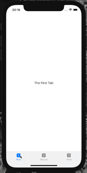
To create a TabView element, we need to pass the Content that is a list of SwiftUI views. To mark this view as a tab bar item, we need to use the tabItem view modifier passing inside a Label that describes a title and image.
Let's now put all this together in the code.
TabView {
  Text("The First Tab")
    .tabItem {
      Label("First", systemImage: "1.square.fill")
    }

  Text("The Second Tab")
    .tabItem {
      Label("Second", systemImage: "2.square.fill")
    }

  Text("The Third Tab")
    .tabItem {
      Label("Third", systemImage: "3.square.fill")
    }
}
Now we can unpack the code above. Each tab is just a Text view, and the tab item is a Label with a title and system image that is an SF Symbol.
Control the selected tab programmatically
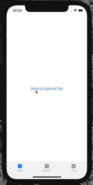
Suppose we want to control the selected tab programmatically. In that case, we need to use the second approach to initialize the method where besides the content, we need to pass a state variable that keeps the currently selected tab. Another critical step is to mark each tab with a tag modifier with a value that conforms to the Hashable protocol. This is how the SwiftUI layout engine differs between the tabs and can understand the uniqueness.
TabView(selection: $selectedTab) {
  VStack {
    Button("Move to Second Tab") {
      selectedTab = 2
    }
  }
  .tabItem {
    Label("First", systemImage: "1.square.fill")
  }
  .tag(1)

  VStack {
    Button("Move to Third Tab") {
      selectedTab = 3
    }
  }
  .tabItem {
    Label("Second", systemImage: "2.square.fill")
  }
  .tag(2)

  VStack {
    Button("Move to First Tab") {
      selectedTab = 1
    }
  }
  .tabItem {
    Label("Third", systemImage: "3.square.fill")
  }
  .tag(3)
}
Let's go over the code above step by step.
Firstly we are using the VStack views with a Button inside to select the next tab or the last the first accordingly.
Then we are using the tag modifier for each of the tab items. We are using the Int value type to keep track of the currently selected tab. We are not limited to the Int value type, which conforms to the Hashable protocol, but we can use our type if we want to. For the sake of simplicity, we are using the Int this time.
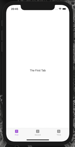
Customize TabView
Sadly there aren't many options for customizing the TabView in SwiftUI. We can change the image and title for the tabs, but that is quite understandable.
We can change the default accent color. Let's change it to purple.
TabView {
 // ...
}
.accentColor(.purple)
TabView styles in SwiftUI
In SwiftUI, we are not limited to the regular tab bar style. Right now, we have three ways how to change the TabView styles:
DefaultTabViewStyle- regular style that we all know;PageTabViewStyle- scrolling pages with the page indicator;CarouselTabViewStyle- specific style for watchOS that we're not going to look into in this post.
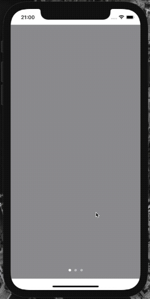
Create scrolling pages
To create scrolling pages with the TabView in SwiftUI, we need to call the view modifier tabViewStyle and pass an instance of PageTabViewStyle style.
TabView {
  Color.gray
  Color.green
  Color.blue
}
.tabViewStyle(PageTabViewStyle())
If we want to hide the page indicator, we specify the indexDisplayMode parameter for the PageTabViewStyle instance and set it to .never.
TabView {
  // ...
}
.tabViewStyle(PageTabViewStyle(indexDisplayMode: .never))
TL;DR
TabBar on the bottom of the screen is one of the most important building blocks for modern iOS applications. Apple themselves is using it frequently in their apps.
With SwiftUI, this element now has the new name TabView. It allows us to add the tab view and control the currently selected tab programmatically.
The hidden feature of the TabView is that we can use it to show the multiple tabs with page indicators, and those can be controlled by scrolling between them. In UIKit, it was UIPageViewController.